ZEE5
Design System
Crafting a scalable design system for multi-platform OTT, one unified language across mobile, web and connected TV.
- Role
- Product Designer
- Duration
- 10 months
- Tools
- Figma · Token Studio · Adobe CC
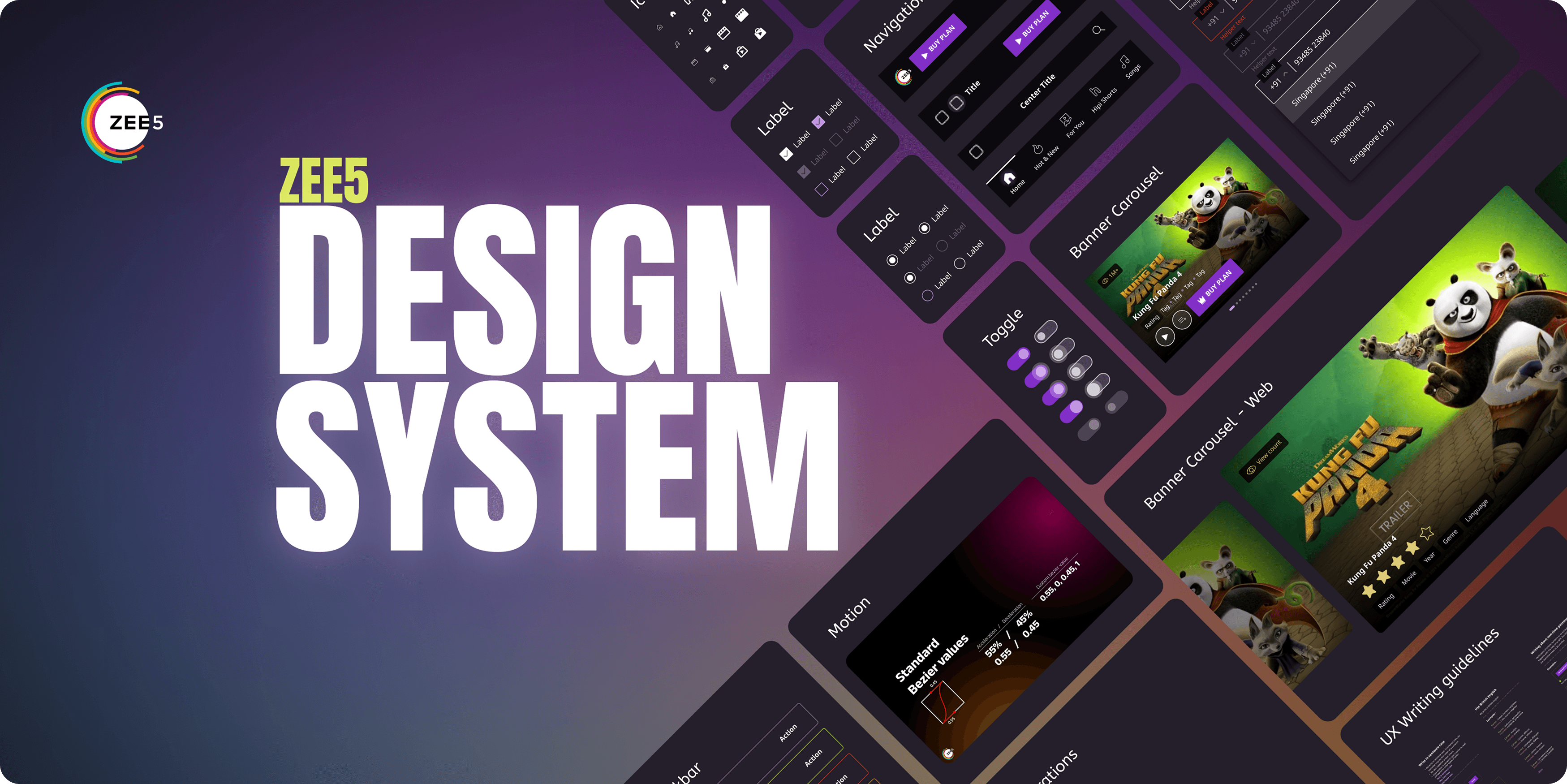
Chaos in design
ZEE5's interfaces lacked cohesion. Buttons, typography and layouts varied across products, and every new project started from scratch.
Inconsistent UI
The same component looked and behaved differently on web, mobile and CTV.
Duplicated effort
Designers rebuilt the same screens per platform, with little reuse and slow handoffs.
Diluted brand
Drifting visuals weakened a single, recognisable ZEE5 identity.
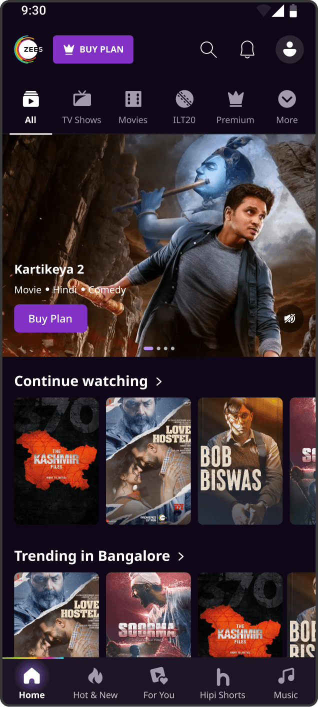
The vision was a unified design language. Not just a component kit, but a toolkit built on clarity, consistency and scalability.
What I owned
Components & tokens
Built advanced components and a full token set for mobile, web and CTV, the backbone every product now builds on.
in production
Old → new migration
Streamlined the process of moving live products onto the new system.
Design → dev handover
Reworked the handoff so engineering could consume tokens directly.
Team workshops
Ran workshops to standardise the design process across the team.
Design-system advocate
Championed the system and helped the whole team adopt it.
A fully tokenised system
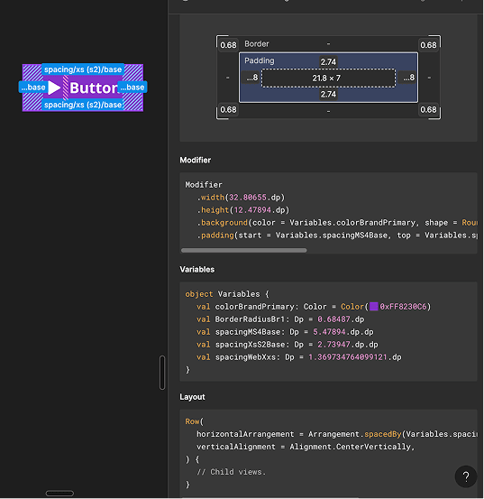
Working with developers, we made every screen deconstructable into tokens. A raw value flows through reference → semantic → component, so one change propagates everywhere.
The building blocks
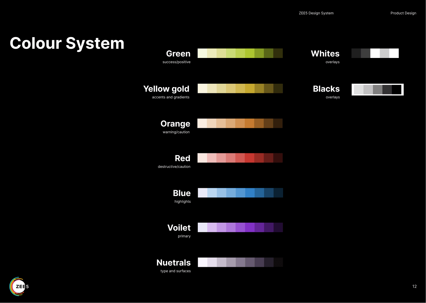
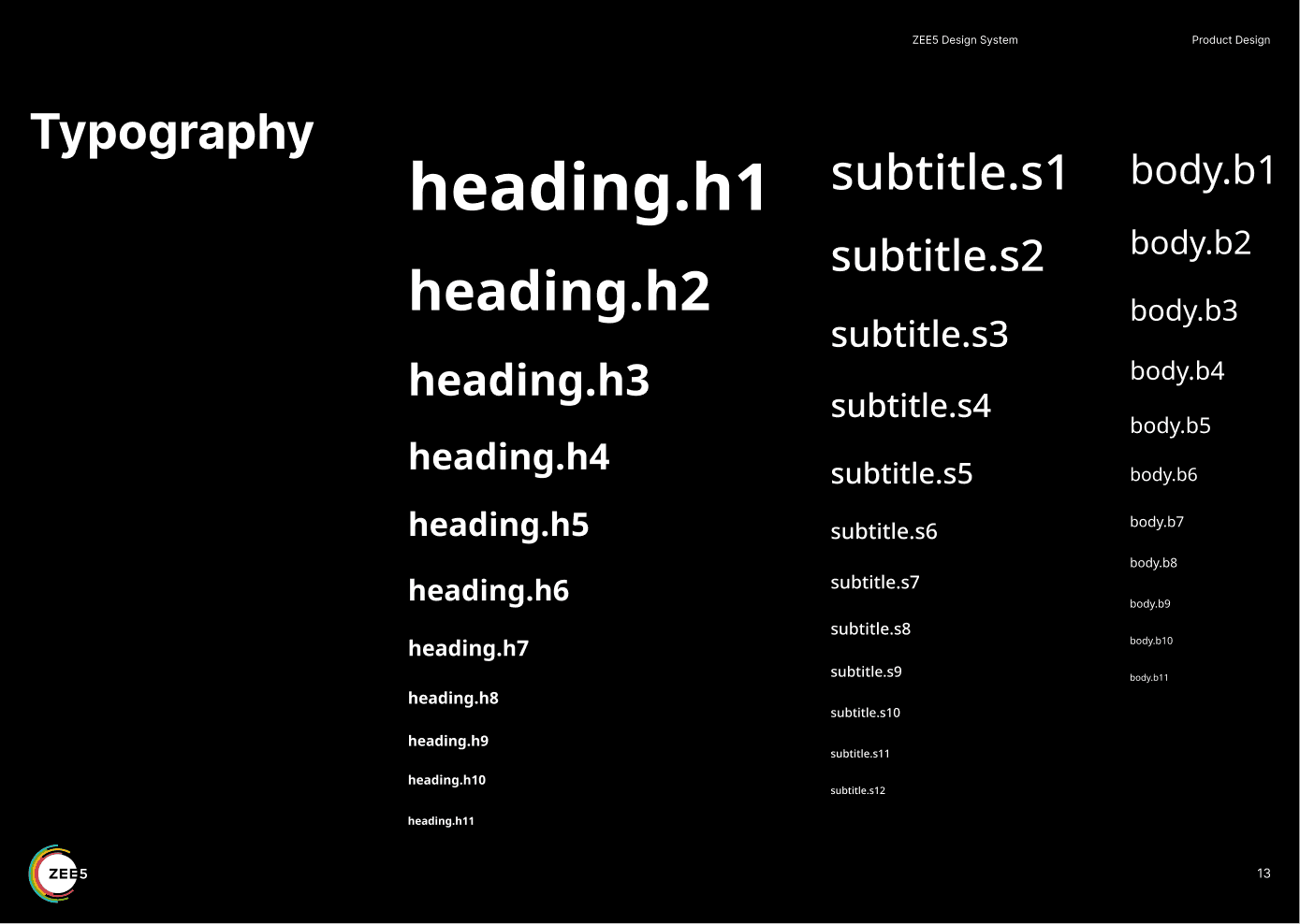
Typography
Heading, subtitle and body scales in one type system, every screen.
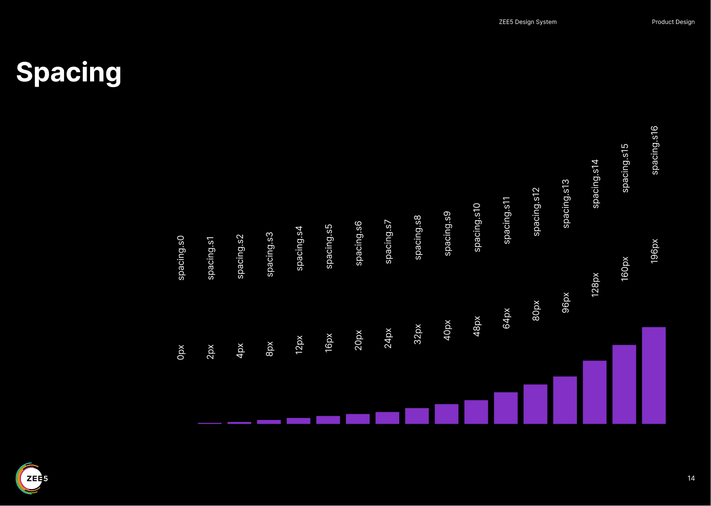
Spacing
A base scale from s0 (0px) to s16 (196px) for consistent rhythm.
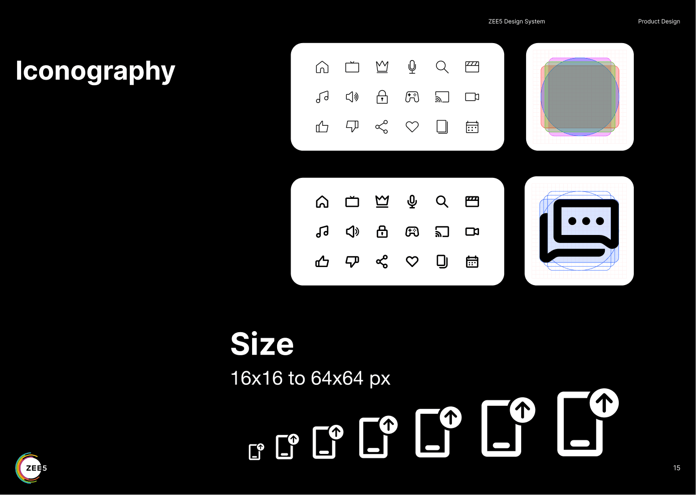
Iconography
A unified icon set on a 16–64px grid.
Illustration & motion
Motion system
A single standard easing curve codifies animation so transitions feel consistent platform-wide. Every reveal on this page uses it.
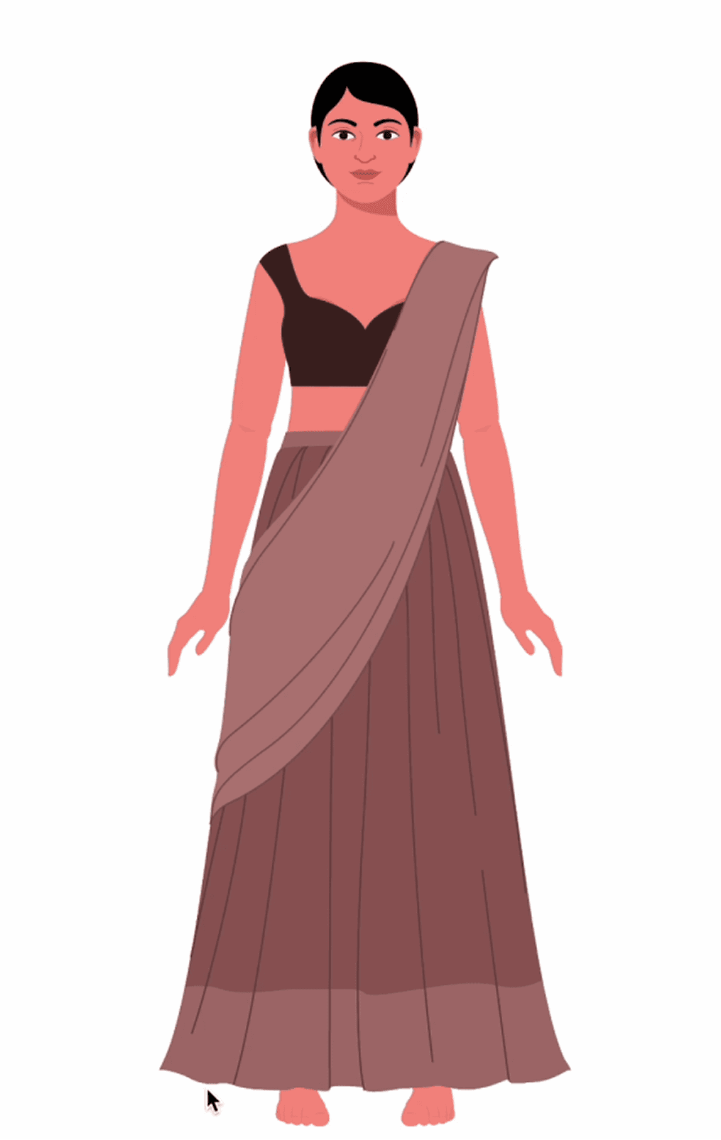
Modular illustration library
Interchangeable faces, outfits and poses build endless characters for onboarding, errors and empty states.
One voice, every screen
Language is part of the system too, not just pixels. A shared writing standard so every screen sounds like one product.
Sentence case
Easier to read; capitalise only the first word and proper nouns.
British English
Colour, authorise, analyse, centre; one consistent spelling.
3 words or less
CTA copy stays short; design does the rest of the talking.
Voice & tone
One glossary, value props and grammar rules for the whole app.
One system, native everywhere
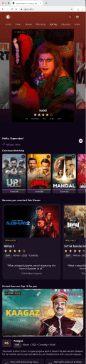
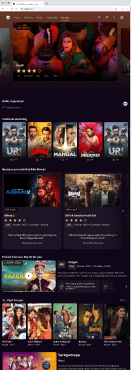
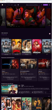
The same flow, true to each platform, built on the same tokens across three native experiences. Consistent accessibility without flattening what makes each platform feel right.
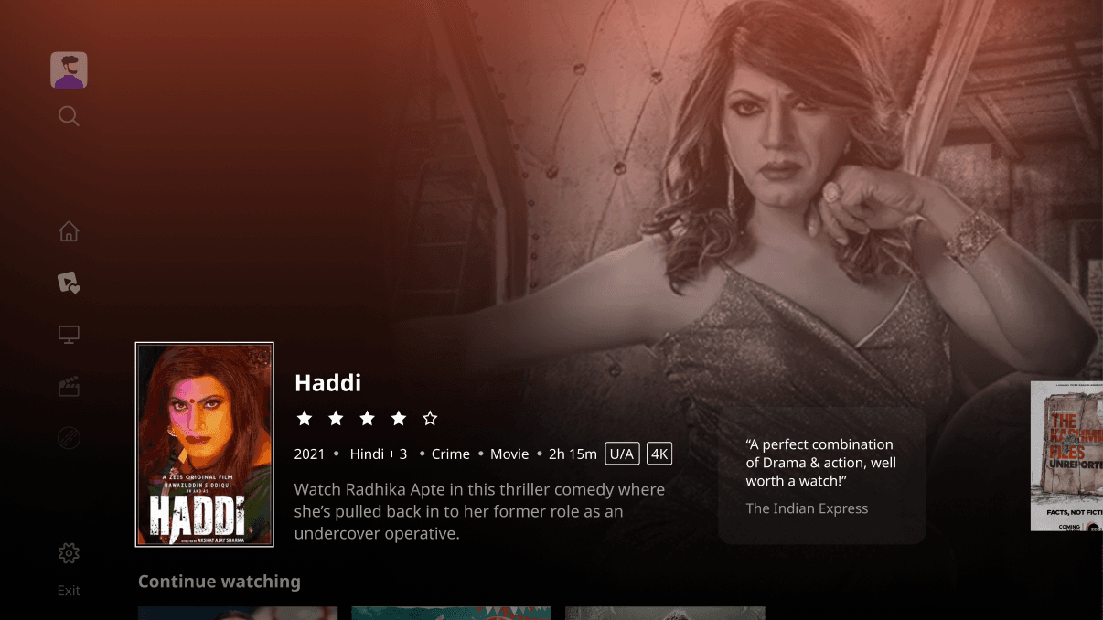
Responsive by default. Components adjust their own size, padding and typography per breakpoint, with responsive tokens linked to semantic tokens, so behaviour stays consistent from mWeb to a 1800px PWA.

Accessibility built in
Colour contrast
WCAG-compliant; buttons hold a 4.5:1 ratio on light or dark.
Colour blindness
Tested for red–green and blue–yellow deficiencies.
Keyboard & screen readers
Dropdowns and modals operable with assistive tech.
XL component mode
An enlarged mode for older adults and low-vision users, especially on TV.
ILT20, Season 2
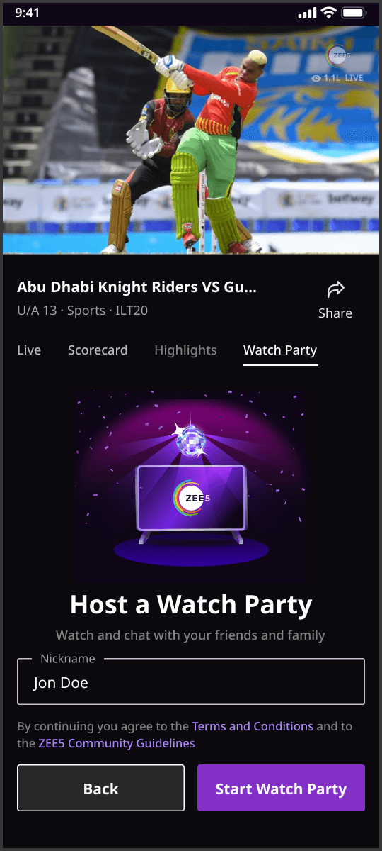
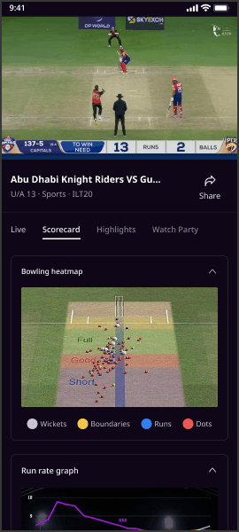
Season 1 took four months, and nearly two of them went into reviews and feedback loops. Season 2, built on the design system, shipped in one month from concept to deployment. Clear tokens removed lengthy dev explanations and review churn.
The system, measured
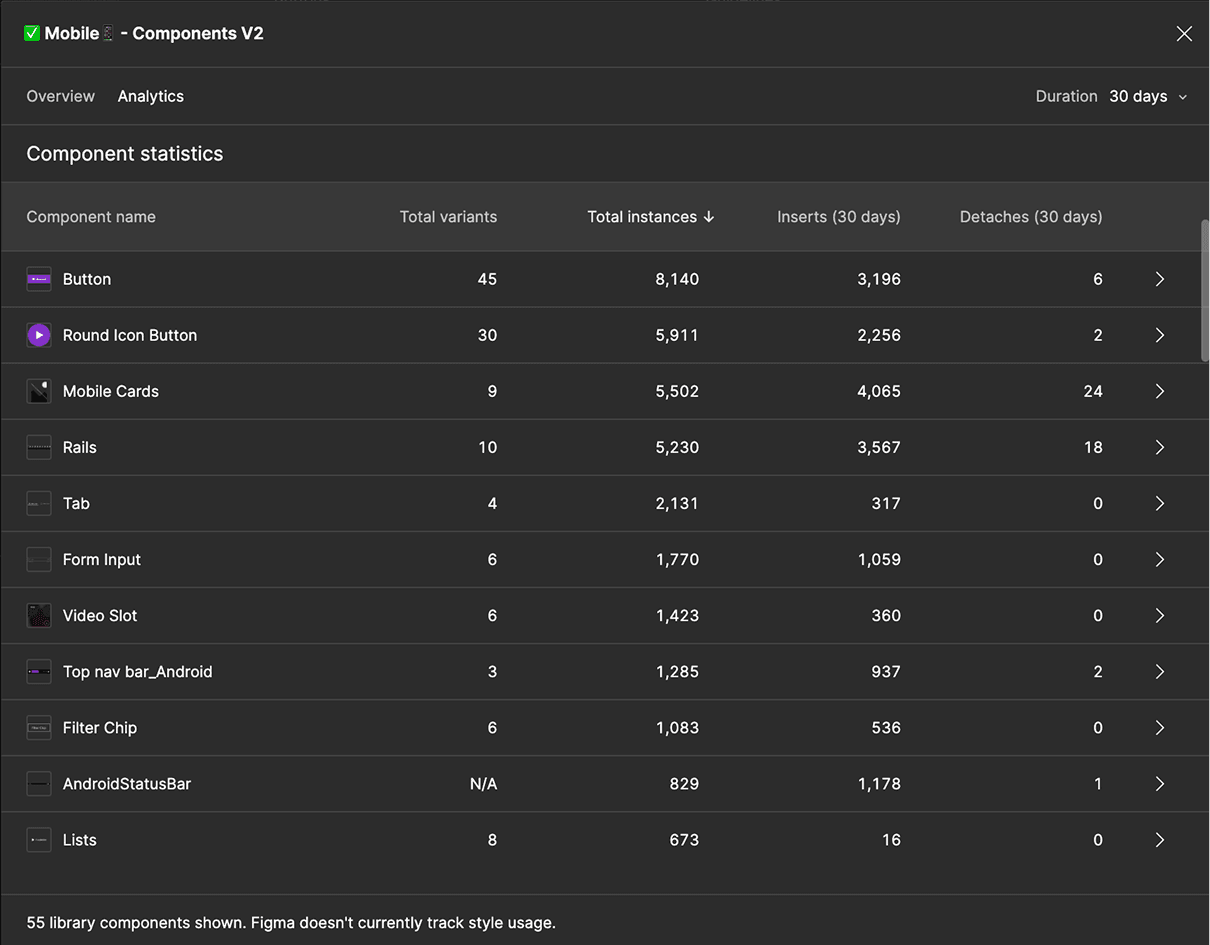
Figma usage analytics let us track real adoption and optimise the library, proof the system was genuinely used and not shelved.
What I took away
Maintaining consistency and scalability is the hard part of large-scale systems.
A living Figma library across teams is ongoing design-ops work, not a one-off build.
Bridging design and development comes down to clear communication and shared tokens.
Designing across mobile, web and CTV taught me each platform, TV especially, needs its own thinking.
Cross-functional collaboration, with shared goals, is where the real leverage is.